
Canva:
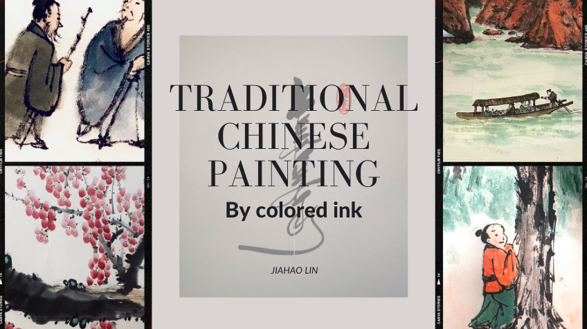
The above picture is a partial detail of several works of my traditional Chinese painting. Obviously, this picture is made by me using the platform of Canva. I have to say I was surprised by the capabilities of Canva. When making slides with Canva, I can easily find the functions I need, such as the fonts, insertion of pictures and other multimedia, or the adjustment of background colors. In addition, countless templates can be found on canvas for creators’ reference.
One of the reasons I like Canva the most is that the picture’s color provided by the creators can be adjusted to the appropriate background color. What’s more worth mentioning is that, unlike the traditional PowerPoint production platform, Canva’s production interface is more aesthetically pleasing, making it easier for people to enjoy making slides.
For example, this picture’s background color is made by Canva because it automatically adjusts according to my oil painting work. I have to say that the visual experience is way better than the traditional production platform. This way, the work created will be visually beneficial to both the producer and the audience. When the audience can accept PowerPoint more visually, they will naturally pay more attention to the content the speaker wants to convey.
When it comes to The World’s Worst Powerpoint Presentations, I think their common feature is that the color matching of the background is not simple enough, which makes the overall look very messy, and the text is too tedious and wordy, resulting in too little white space. When I was reading the PowerPoint, I didn’t want to continue reading because of the poor visual experience. In other words, the creators of these PowerPoints only use them as a tool for loading text but do not distinguish which key information should be conveyed.


lingjiang
2022-10-09 — 4:03 am
Hi, Jiahao
After reading your blog post, I agree that Canva makes me enjoy making slides. Canva gives me good experience of making infographic. There are a lot of pictures provided for use. I don’t need go to Google and search. Furthermore, I agree your opinion that presentations in the The World’s Worst Powerpoint Presentations are wordy. I cannot find the most important point in these presentations.
Jialong
2022-10-09 — 12:09 pm
Hi, Jiahao
After reading your Blog, I can clearly see that you have developed your own vision of how to use canvas, which is reflected in your poster of traditional Chinese culture, which shows that you have developed a certain level of proficiency in using the tools in canvas. The overall drawing style and typography of your poster are very professional because you use hierarchy to help focus your design and Leverage contrast to accentuate important design elements. I very agree with you that, Unlike traditional PowerPoint authoring platforms, Canva’s authoring interface is more aesthetically pleasing and makes it easier to enjoy creating slideshows.
xinyiiw
2022-10-09 — 3:25 pm
Hi Jiahao, thanks for the great post ! I like your choice of colours for your presentation, it is very pleasing to the eye and blends well with the artwork palette. I think it is interesting to think about Canva as an alternative (or addition) to using Powerpoint: it could be very beneficial especially in a corporate setting to ensure consistency and professionalism in presentations. I agree with your point that if the presentation is accepted visually, the audience will naturally be more engaged.