Since the beginning of this semester, we have learned a lot about techniques in graphic design. In this post, I redesigned a portfolio PowerPoint of my artworks I made five months ago using knowledge and concepts and my understanding based on 8 basic design principles to help you make awesome graphics.
Next, I will show the results of before & after the redesign, hoping to get suggestions from everybody in the comment section!
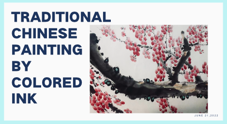
Before & After Page#1:

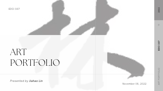
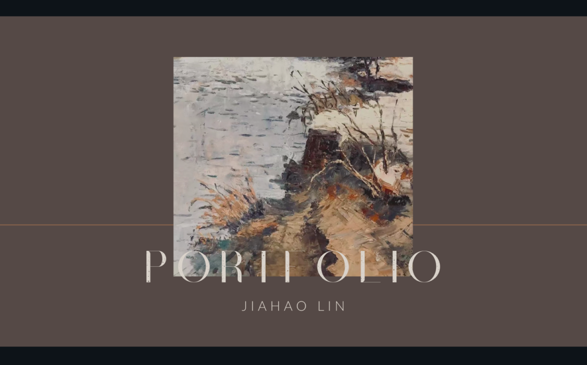
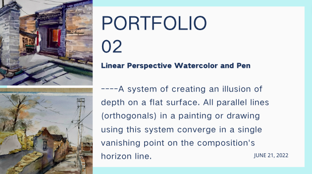
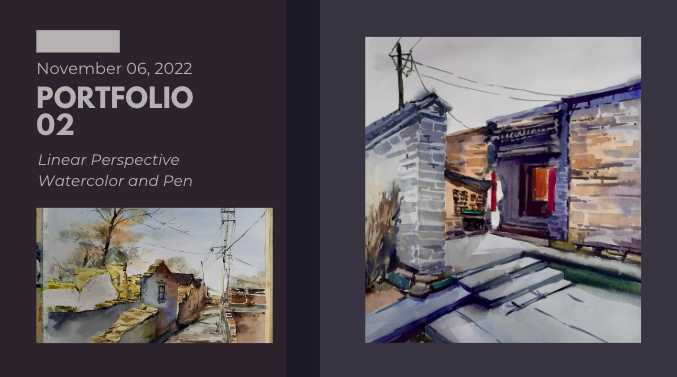
The first thing we can see above is the covers of the PowerPoint before and after the changes. According to the principle of using hierarchy to help focus design, since this is a portfolio of artworks, it needs artistic elements as a background to let the audience better understand what they are about to see. At the same time, the pre-modified cover was too simple.
Before & After Page#2:
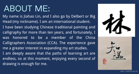
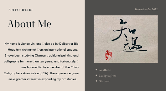
The above pictures are pre and post-design of my self-introduction page. If there is too much text in the PowerPoint, it is easy to make the person reading it visually tired, so there is no way to focus on the text content. I shortened my introduction according to the theory of Optimizing color to support design and adjusted the background and text color to the same tone through the function on Canva.
Before & After Page#3:
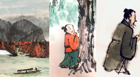
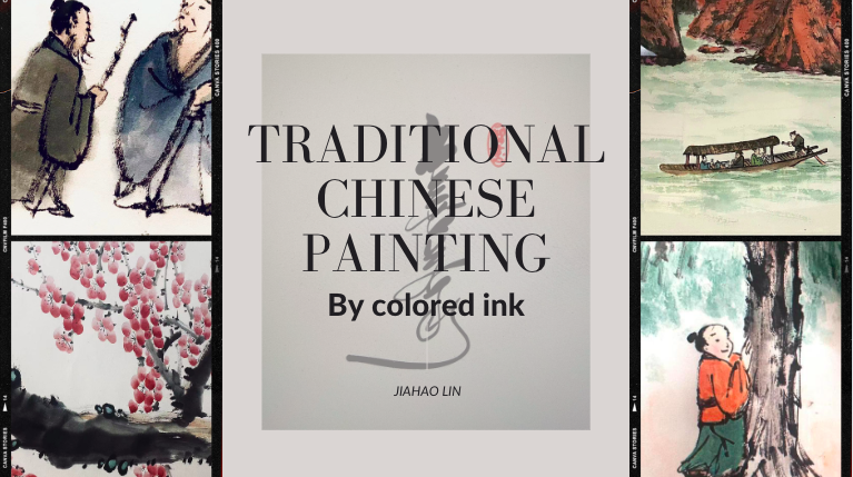
Here I made a unique adjustment, combining the two pages of the PowerPoint before the change into one page after the change. According to the theory of making sure designs have balance, I think the title of the first one before the modification is too big, and the pictures shown are too single, while the images shown in the second one are too many, although the area is even, the balance is lost. So I combined the title and pictures into one and made a balanced adjustment.
I think the visual balance is the worst thing I did, so I made many changes to balance based on concepts, such as leaving lots of negative space and optimizing color to support design. Moreover, I modified many elements, including the proportion of text and pictures, the collocation of text color and background color, the balance of text quantity and white space, and the call for the position of text and pictures.
Other Before & After examples I adjusted based on what I’ve learned:
Example #1:
Before:
After:
Example #2:
Before:
After:


Example #3:
Before:

After:
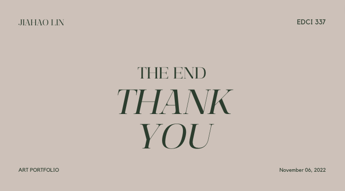
AND OF COURSE…THANK YOU FOR READING MY POST!
Before:
After: